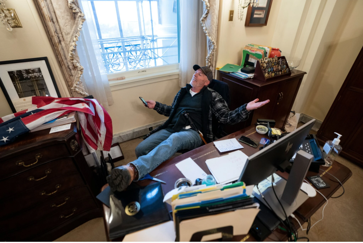
Do I like this? Yes. Which parts do I like? It’s of a person who probably doesn’t get their picture taken often. The picture doesn’t feel staged. It’s capturing a moment. The person doesn’t seem self-conscious or at least doesn’t care/ know they’re getting their picture taken. The guy seems like a piece of shit. It’s funny. Contrast between scummy dirty guy and senator’s office and how relaxed he is. His body positioning looks like a pose but doubtful he was actually posing. How did they take this picture? No flash? All parts of picture in focus so small aperture? Angle seems like it’s from standing on chair or little desk.
What parts could be better? Distracting image. Need context to enjoy it fully. More of a funny picture than a good picture? Without context, not a particularly good picture. Wish there was more of his feet/ soles of his shoes. How could it be changed? Angle lower and closer to shoes? Having him look into camera.
Wesley Verhoeve’s instagram
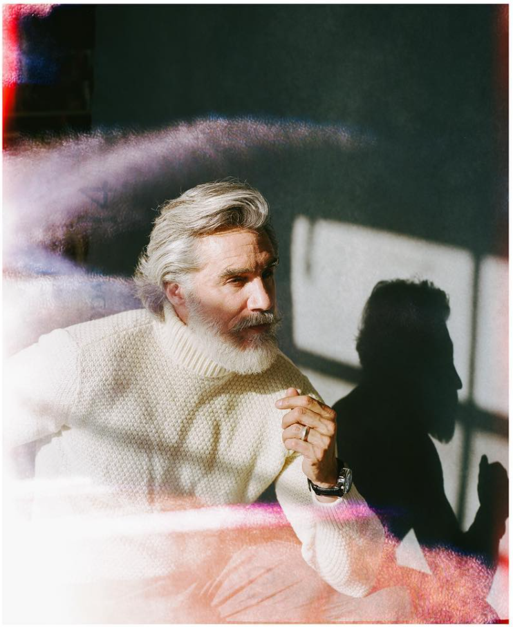
Do I like this? Mostly. Which parts do I like? It makes you want to keep looking at it. It feel structured with its three layers. The double exposure and the hair work well together, coherent. The sweep of the hair and the curve of the double exposure have the same curves. The color of the exposure feels fantasy-like and is consistent with how he’s posed and how he looks. Posed in a natural-ish way. How did they take this picture? Background not as in focus, so not completely closed aperture. Light at photographer’s back. Posed. Photographer probably standing while guy seated. What parts could be better? The guy seems annoying and would be very please with vain about this photo. Seems like a person that is very conscious of how he looks. The way he squints is annoying. Dressed too nice, like a bitch. How could it be changed? The things I don’t like are more personal preference for what I like to see pictures of, so far what this picture is, I’m not sure there’s much I would change. It’s a lightning in a bottle picture.
3. I forget, some author I think
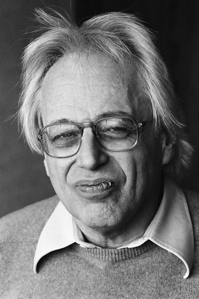
Do I like this? Yes! Which parts do I like? Expression on face is smug. Hair unkempt, glasses, chapped lips. Very unique looking. Can tell that it’s someone who doesn’t get his picture taken and doesn’t care. Visually very interesting to keep staring at. Someone who looks interesting but isn’t trying to, not attention-seeking. No pretension here. How did they take this picture? Forefront in focus, more open aperture? Close-up. What parts could be better? I would’ve taken it a little bit farther back. How could it be changed? Color. Farther back.
4. Doug Dubois from All The Days and Nights
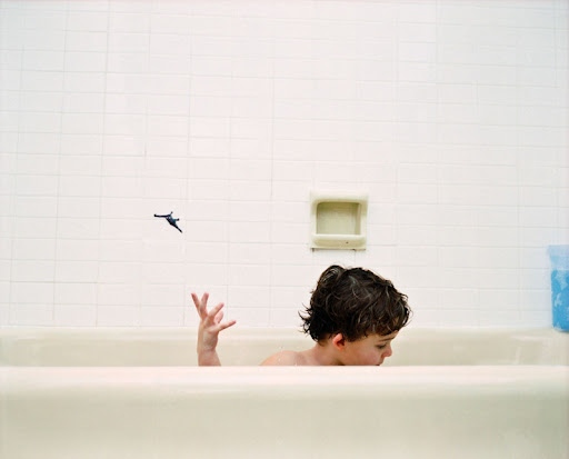
Do I like this? Yes. Which parts do I like? Feels natural, could be staged but doesn’t feel like it. Captures a short-lived moment. Clean lines of the tub, the tiles, the soap holder. Contrast between dark hair and dinosaur with the different shades of white. Boy is pre-occupied with his own things. I like the distance between the dinosaur and his hand, the angle of his fingers. Splashes of color with his skin and the blue. Lines of the tub obstructing his features. How did they take this picture? Quick shutter speed. Soap holder not quite in focus but not blurry either. Some in-between aperture. No flash. What parts could be better? I wish I could see lines of the tile a little better. I wish the lines were more perfect horizontal but it doesn’t really matter. How could it be changed? Straighter lines, less space on left, more of right. With objects were centered slightly more left. Darker blacks/shadows for the lines on tile and soap holder.
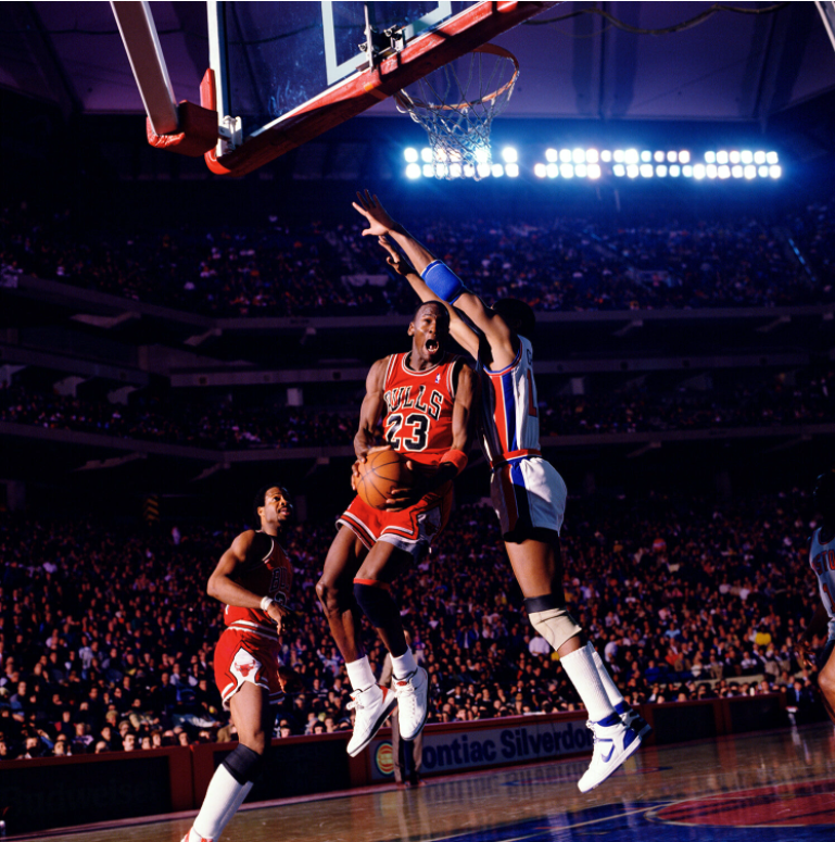
5. Walter IoossJr., 1987
Do I like this? Yes, a lot. Which parts do I like? The lighting is my favorite part. It looks like they’re playing in natural light at sunset. It looks much darker than a normal stadium would be which I’m sure wasn’t the case in real life. The contrast and especially the dark shadows in the back with the lightness on Jordan and the action makes it seem all the more majestic, like it’s Greek gods or titans fighting.
The part I like most is the natural light feeling. I think it’s because it makes you think about playing basketball into the evening as a kid. Even when you’re shooting around alone, you pretend to be doing moves as if you were your favorite player and this feels like what a kid would imagine. I feel also like it adds a nostalgic feel to the picture somehow, on top the nostalgia of 1980s NBA basketball.
Most sports pictures are good when they fall into the ‘right place, right time’ category, which this one I think would be good and cool if that’s all that it is. The lighting makes this picture really special.
I also like the way the crowd looks. It’s resolved enough that you can make out individual faces but not so much that you can see their expressions which I think would be distracting. I like that the only faces you can really see are Jordan and his teammate, which I imagine is pretty rare in basketball photos.
I like the clean-ness of the uniforms and the shoes and socks. There are also other elements that make this picture cool, outside of the actual picture. The subject matter of young Michael Jordan makes it better. It wouldn’t feel the same if it was Clyde Drexler, for example.
I suppose the lines also make the picture nice to look at. You can draw a path between the defender’s arms and the bottom of the backboard. And Jordan’s teammate’s body nicely parallels the angle between Jordan’s quads and torso.
How did they take this picture? Per Walter Iooss’s instagram: “This image is an excellent example of my minimal stadium lighting. It’s all strobe-lit: one is coming from the side and another from the other end of the court. 1987 is also the year I first started to cover Michael Jordan and follow him around, so it’s a meaningful year in that respect. Michael just makes every picture look good. The open mouth and signature tongue flying, the light. It’s one of those shots.”
I don’t really know how strobe lights work. The side strobe-light makes sense to me, I’m not sure about how strobe lights work.
I’m also impressed how he got the picture so in focus, I’m not sure if auto-focus was used or if he just set up to be in focus at that distance under the hoop.
What parts could be better? You see a sliver of some guy’s knee on the bottom right.
How could it be changed? Nothing.
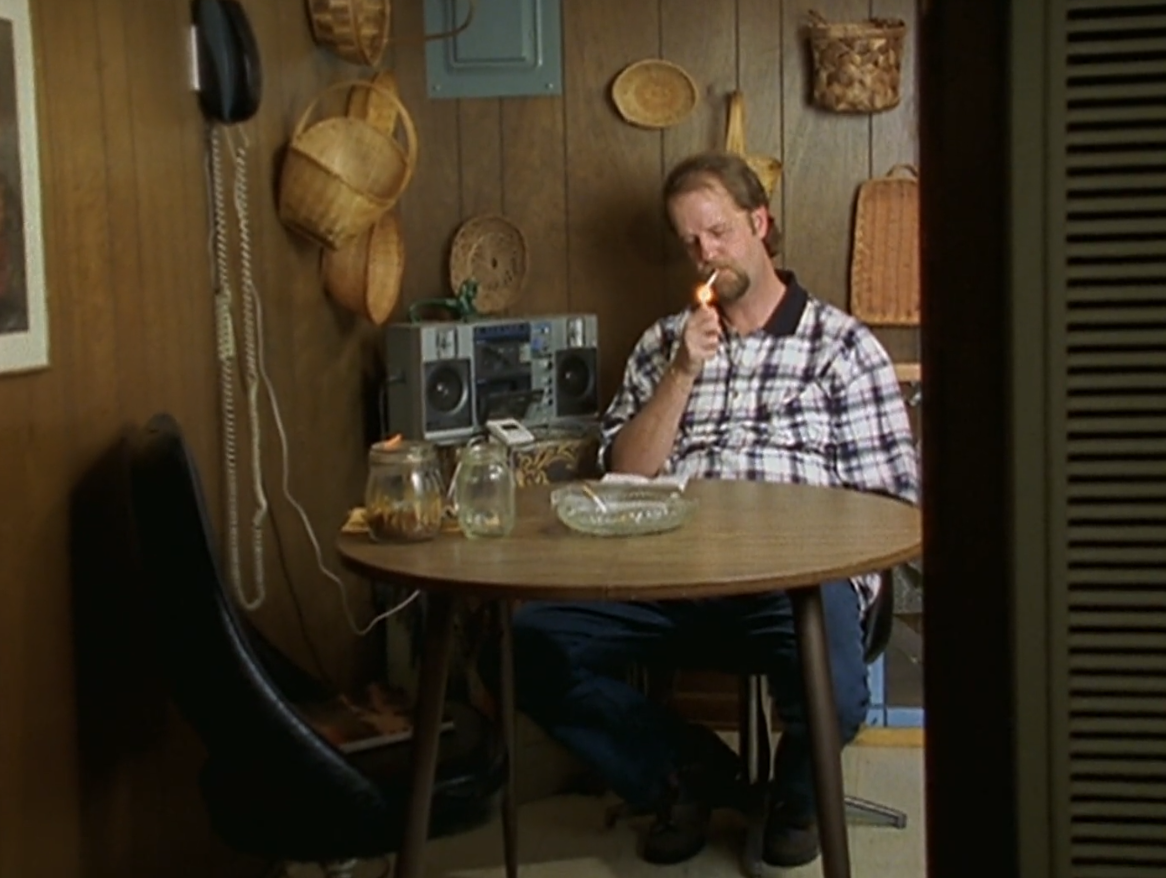
6. Screenshot from Paradise Lost II documentary
Do I like this? Yes. Which parts do I like? I like the layout of the shot. I wasn’t very discerning about which part of the video I screencapped. It makes him seem very lonely, though perhaps that’s because I watched the documentary and know more context. Aside from that I think it’s due to the way he’s surrounded by clutter and things collected, but at the same time is sitting by himself in a comfortable way that makes it seem like this is just how he lives. The wall and door on the right side makes it seem more distant which I think adds to the effect, like you the watcher are about to leave and he’s going to totally by himself once you do. How did they take this picture? It was video.
What parts could be better? I like it as it is. How could it be changed? I like it as it is.